Introduction
The Team
Sigrid Bakås, Kristin F. Dahle, Vendel Eikemo,
Susanne Ryland og Yara Mathisen
Additionally, we had with us five skilled professionals from Nagra Kudelski from various fields at our sprint workshops.
The Problem Statement
and Our Solution
We were presented with a challenge by Nagra: Today, consumers unknowingly accept and share news, videos, and articles that are potentially untrue (misinformation).
Our solution was a fact-checker in the form of a Chrome Extension, which would help users verify news, images, and videos online.
My Role
UX Designer , Sprint facilitator
4 months
Duration of Project
The Result
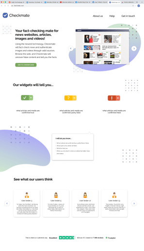
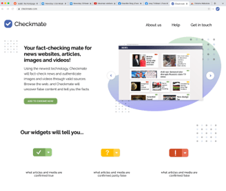
Based on our initial data collection and sprint workshops, we ended up designing a Chrome Extension to fact-check news websites, news articles, images, and videos.
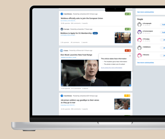
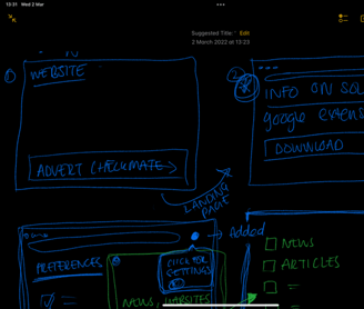
We created a user flow that begins with the user downloading Checkmate in Chrome via a landing page we developed. From there, they navigate to Reddit with Checkmate activated, featuring widgets that lead to information boxes containing the facts.
First Iteration:
Users lacked trust in Checkmate.
Needed more general information about Checkmate and Nagra.
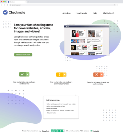
Solution: Created a landing page to provide information about Checkmate
The Landing Page
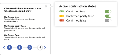
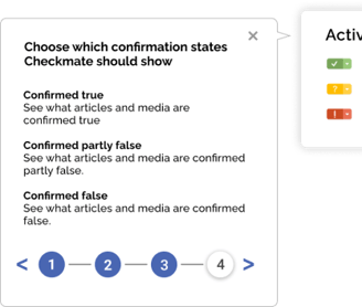
The Guide for the Preferences
The Preferences
The Widgets
The Information Boxes
Warning Before Sharing
Demo video of the user flow
Prototype in Figma
Moving forward, I will go through the various main features of Checkmate and how they have evolved over our four iterations.
Solution to Second Iteration Feedback:
Added an image carousel to illustrate how Checkmate works.
Clarified language and simplified the top menu for easier navigation.
Added user reviews and Trustpilot at the bottom of the page.
Main goal: Increase Checkmate’s credibility and ensure users felt well-informed.
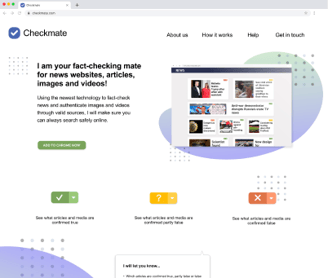
The first version of the landing page
The final version of the landing page
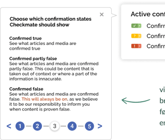
The Preference Guide helps users navigate Checkmate and its options. It wasn’t included in the first iteration, but we decided to add it to avoid confusion.
The guide is divided into five sections: the first four guide users through the preferences, and the final step completes the tutorial. This ensures a quick and seamless introduction for users.
The first version
The final version
First Iteration:
Users couldn’t choose activation states for Checkmate.
Widgets only highlighted content marked as "confirmed false."
first iteration
second iteration
third and fourth iteration
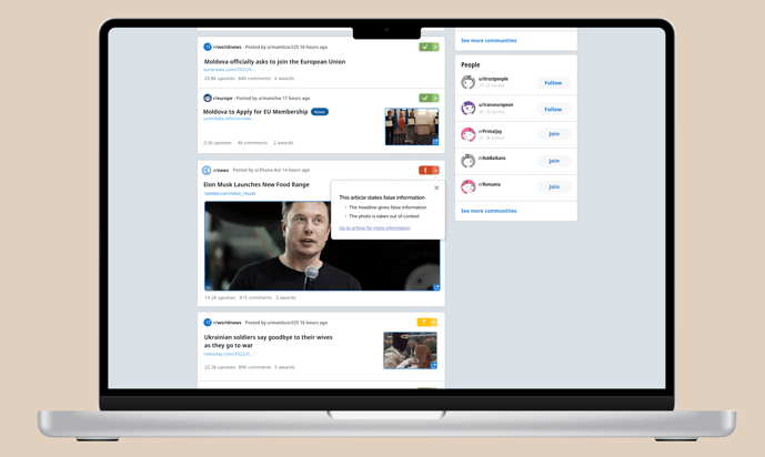
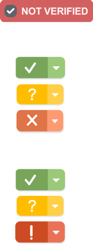
Widgets are a key feature of Checkmate, informing users about the verification status of content.
First Iteration
In the first iteration, we only marked media with false information using a "Not verified" widget. Clicking it revealed an info box detailing the misinformation.
Second Iteration
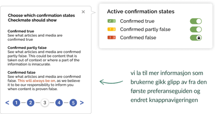
The feedback suggested distinguishing between verification states. We introduced three statuses with a traffic light concept: "confirmed true," "partially false," and "confirmed false."
Third Iteration
The feedback indicated that the "x" icon seemed like something users should dismiss, and the red color appeared more orange and less alarming. We updated the appearance of the "confirmed false" widget accordingly.

første iterasjon
andre iterasjon
tredje og fjerde iterasjon
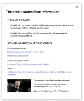
The information boxes provide users with details on the facts, sources used, and what information is false or misleading.
There are two types of information boxes:
Small Version: Appears when you click on the widget.
Large Version: Offers more detailed information and appears when you navigate to the actual article or video.


Small Version


Large Version, First iteration
Large Version, Second iteration
Large Version, Third iteration


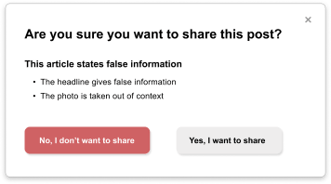
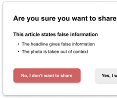
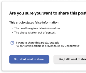
The warning message appears when a user attempts to share an article, alerting them about the presence of false information.
First Prototype:
Warning appeared only for articles with false information.
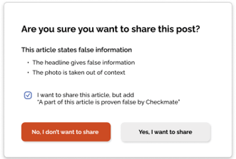
Second Iteration:
Added a checkbox: "I want to share this article but include 'Part of this article is proven false by Checkmate'" (checked by default). This allows users to acknowledge false content before sharing.
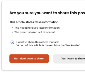
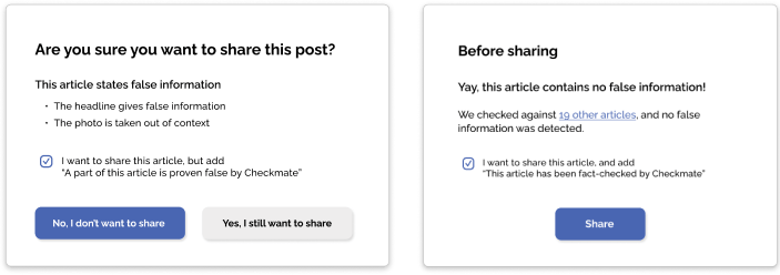
Third Iteration:
Changed the "I don't want to share" button from red to purple because red was associated with avoiding actions.
Renamed the right button to "Yes, I still want to share" to emphasize the impact of sharing.
Added a popup message for articles without false information to confirm accuracy.
First Iteration
Second Iteration
Third Iteration
Second Iteration:
Feedback indicated language issues and a need for more illustrations.
Solution: Added clearer language and more visuals to the landing page.
Third Iteration:
Decided not to let users hide widgets marking "confirmed false" content.
Goal: Ensure users are informed about false content.
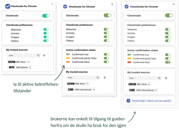
Added easy access to the Preference Guide if needed.
Second Iteration:
Introduced three different confirmation states.
Allowed users to select which widgets to display.
Lessons Learned
Working Digitally in a Cross-Functional Team
Digital and Unmoderated User Testing
Good communication is crucial and can be maintained digitally.
Structured sprint workshops ensured effective discussions and participation.
Cross-functional teams create synergy and enhance knowledge sharing.
Initial unmoderated testing lacked follow-up questions and detailed feedback.
Moderated testing provided more constructive and detailed feedback, highlighting usability improvements.
Moderated testing earlier could have changed the project's outcome.
Balancing Conflicting Feedback
Positive feedback on allowing sharing despite false information versus concerns about potential issues.
Decided to keep sharing option to uphold freedom of expression, aligning with our concept and project values.
First Experience as a Design Sprint Facilitator
Importance of trusting decisions and leading confidently, even among more experienced members.
Be willing to adjust the program and manage time strictly for progress.
Acknowledge and move on from mistakes while learning from them.
Work Process and Methodology
The Google Sprint Process
Working on the challenge of misinformation has been daunting due to unresolved ethical and technical questions. While the expert team from Nagra helped us navigate these issues through the sprint workshops, our focus remained on developing a product that meets user needs. Using the Google Sprint method ensured disciplined and effective collaboration, idea testing, and problem-solving.
The sprint included four workshops, each with specific goals and focuses. Nagra representatives participated in all four workshops, while our team prototyped and tested outside these sessions.
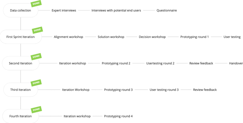
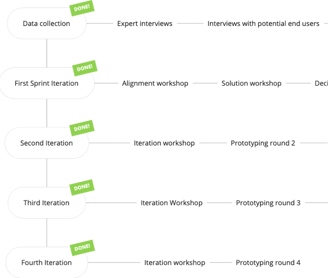
Overview of Our Sprint Process Throughout the Project
Pre-Sprint Research
To lay the foundation for our project based on Nagra's challenge, we conducted a pre-sprint data collection where we:
Interviewed 4 potential end-users
Interviewed 4 experts
1 interview with a journalist
1 interview with an NFT/Blockchain expert from NTB
2 interviews with researchers on visual content verification
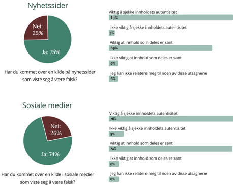
Administered a survey with 51 respondents
Hovedfunn fra spørreundersøkelsen (51 svar)
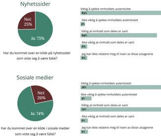
Key Findings from Interviews with Potential End-Users
The older group was less critical of Norwegian news sources, while the younger group had a more critical mindset.
All expressed a need to verify whether content is true or false.
The process of verifying content was considered quite tedious.
Key Insights from Expert Interviews
Importance of Media Authentication: Verifying media content is crucial and will become increasingly important in the future.
Trust in Norwegian Media: Trust in media in Norway is relatively high, so a fact-checking solution is seen as a "nice-to-have" locally but potentially essential internationally.
Implementation Challenges: Implementing a universal system for all media companies may be problematic. It is more logical to consider potential solutions from a content consumer’s perspective.
Workshop 1: Alignment
The main goal of this workshop was to explore the problem space and adapt to the challenges we aimed to address. Based on our research, we decided to focus on the end-user, as their needs appeared to be quite clear.
From there, we developed our two-year goal and sprint questions that guided our solutions and decisions throughout the sprint.
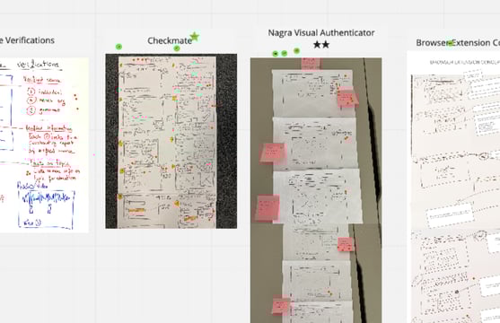
We also created "Lighting Demos" (image to the right), which served as inspiration before generating our own ideas in Workshop 2.
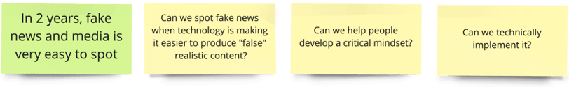

Two Year Goal
Sprint-questions
Workshop 2: Solution
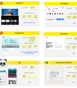
The second workshop focused on finding inspiration and starting to develop solutions. We reviewed our previously created "Lightning Demos," voted on the most inspiring ones, took notes, sketched, and doodled individually.
Following these preparations, we did a round of "Crazy 8s" to foster a good creative flow for everyone. Then, each participant created "Solution Sketches" as a working pitch deck for their proposed solution.
Workshop 3: Decision
The third workshop began with the solution sketches from the previous session. Elements from the various sketches were voted on, and user test flows were created based on these.
Following this, all sprint participants collaborated on a storyboard of the user test flow. This storyboard became the basis for the first round of prototyping.
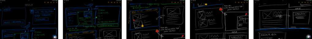
Practical user flow-sketches
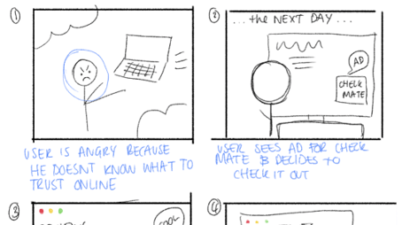
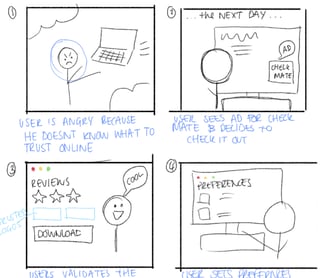
User Flow-sketches
Workshop 4 & 5: Iteration
Before the iteration workshops, we created the "Sailboat," a summary of user feedback structured and visualized to categorize responses. We voted on and selected the top challenges to focus on. These top challenges were then used to create "Can we validate that..." questions to guide the sprints. The sprint concluded with choosing a user test flow to focus on for the next round of testing and prototyping.
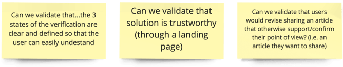
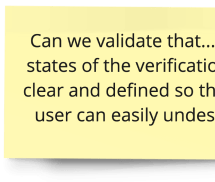
Our chosen"Can we validate that..."-questions
User Testing
Using UserZoomGO, Nagra's preferred tool for external digital user testing, we tested our prototype with an international audience aged 18-60. This allowed us to conduct unmoderated sessions where participants answered questions and completed tasks while thinking aloud and sharing their screens.
Through two rounds of unmoderated testing with 13 participants, we gained insights into news habits, first impressions of the Checkmate concept, ease of downloading the Chrome extension, and overall usability.
In the third iteration, we conducted moderated testing with seven Norwegian participants to test the latest changes. This interaction revealed more emotional engagement and provided valuable feedback for further improvements.
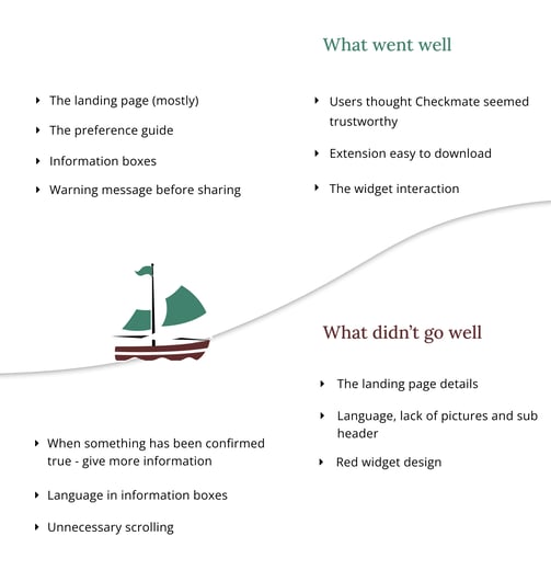
"The Sail Boat" with user feedback