Introduction
Problem Statement
The Team
Insurance is complicated and uninteresting for young people, even though it is necessary when buying a home and getting a mortgage. Insurance products are similar from company to company.
We were a total of four designers and four developers working together in an interdisciplinary team, with valuable assistance from two mentors from Fremtind along the way.
The Case Fremtind Presented
Become a significant factor in the decision-making process for young first-time buyers to choose our distributors (DNB & Sparebank1) for their mortgage and insurance needs.
My role
Interaction Designer
Our Scoping of the Case
Based on our insights, we formulated the following problem statement:
'To help young first-time buyers (aged 18-34) understand their own insurance needs and make the conversation with their advisor more balanced, straightforward, and effective.'
7 weeks
Duration of Project
The Result
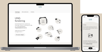
Our solution is a combined platform designed for young people to learn more about their insurance needs. The solution is tailored for both mobile and desktop.
The platform consists of three main sections:
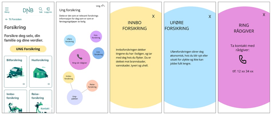
"The Bubble Page": This serves as a simple information page where users can easily read up on different types of insurance.
"The Need Calculator": This allows users to take a short quiz to receive suggestions on which insurance options are relevant for them.
The Glossary: This provides users with insights into complex insurance terms in a clear and user-friendly manner."
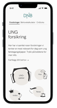
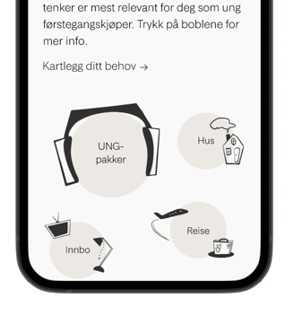
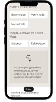
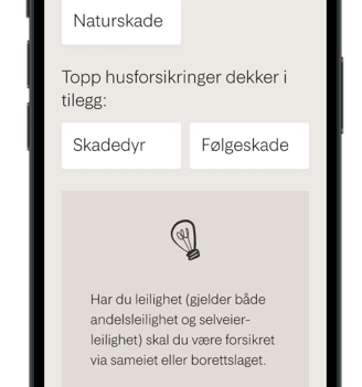
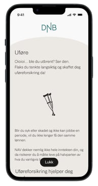
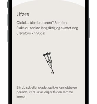
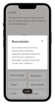
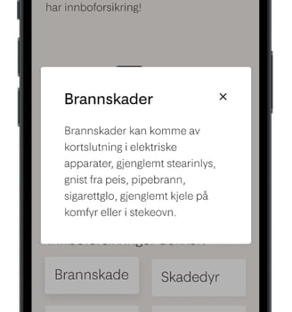
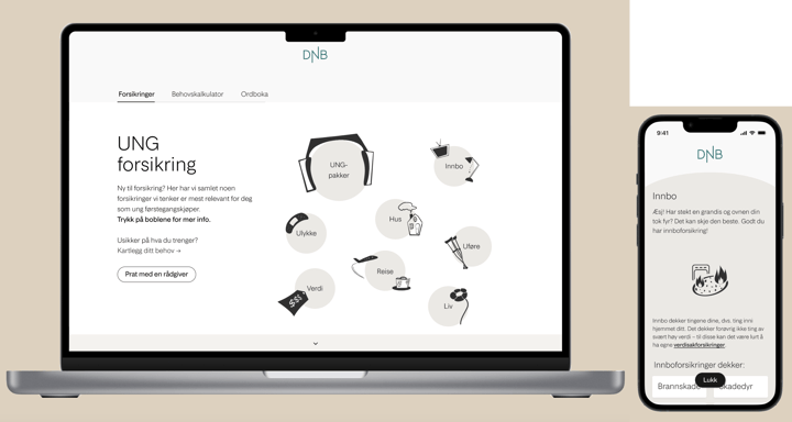
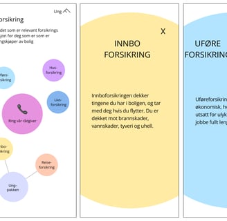
The information page, which we named 'The Bubble Page' in our project, is named after the bubbles that users can interact with on the page.
Users can click on each bubble, which then 'opens' and allows them to read more about each type of insurance.
We chose this 'menu solution' to make it more engaging for users to interact with the information.
We also used custom illustrations that fall outside the Jøkul design system. We did this because insights from our target audience show that they find large amounts of text overwhelming. By incorporating illustrations, users have visual anchors to associate with the text.
As one user mentioned during the usability test, 'When I see a light bulb, I expect it to indicate a tip or useful information.'
"The Bubble Page"
"The Need Calculator"
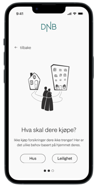
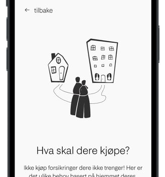
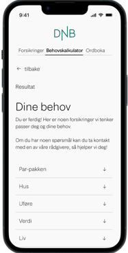
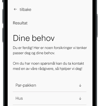
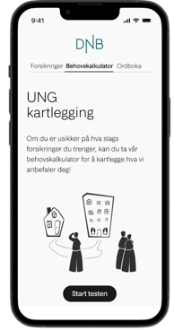
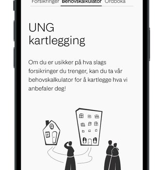
The Need Calculator is a three-step quiz designed to help users assess their insurance needs.
Based on insights from our discussions with experts from Fremtind, we identified three key questions:
Are you buying alone or with someone?
What are you purchasing: a house or an apartment?
Do you own individual high-value items?
These questions were determined to be relevant for users and served as the foundation for this calculator.
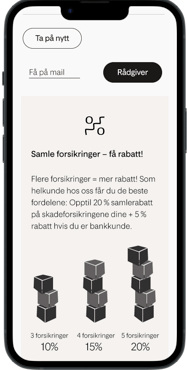
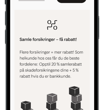
After answering the questions, users are presented with a results page that highlights their needs based on their quiz responses.
Additionally, we chose to visually emphasize the potential for discounts using our illustrations, as our data collection clearly showed that price is important to our target audience.
We aimed to make insurance understandable, so the language used is crucial. Fremtind's voice should be bold, warm, and precise, which we have focused on in our solution. However, we also opted for a more conversational tone to appeal to users.
The Glossary
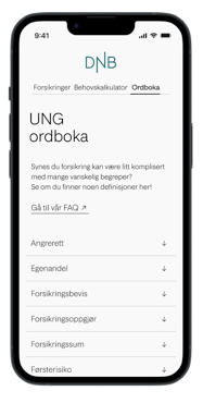
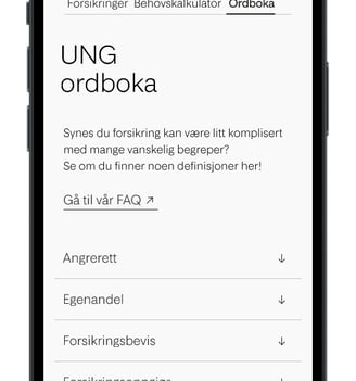
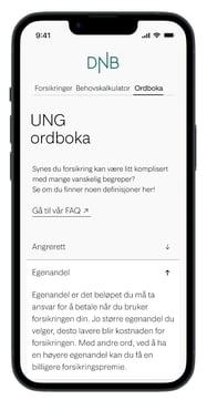
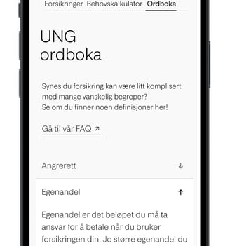
Insurance is difficult and tedious for many, as we discovered through our data collection.
One issue we identified was that many users had little or no familiarity with the technical terms related to insurance.
To address this, we created a glossary that allows users to quickly familiarize themselves with these terms and explore them in an accessible way through a dropdown menu of terms.
Lessons Learned
Working with a Well-Established Design System
Not Being Afraid of Asking for Help
Continuous Communication in an Interdisciplinary Team
Dare to Challenge the Established (when called for)
Not Stopping at the First Good Idea
Fremtind has a design system called Jøkul, which has been recognized by the Norwegian design community (Grafill) and awarded gold in Visuelt for design systems.
During this project, I had the pleasure of learning and using Jøkul with guidance from experienced designers at Fremtind.
I found several benefits in using an established design system, including:
Efficient Work Distribution: Enabled the team to work efficiently while maintaining a cohesive design.
Cross-Disciplinary Collaboration: Developers accessed the necessary code to implement Jøkul elements easily.
Focus on User Experience: Allowed us to concentrate on interaction and user experience without building a new design system from scratch.
Supportive Environment: Learned that no questions are dumb; Fremtind provided strong support.
Training: Received comprehensive training in the design system, design tools, and auto-layout.
Expert Insights: Gained valuable understanding of insurance complexities and nuances.
Initial Idea Temptation: The Need Calculator seemed promising after initial data.
Exploration of Alternatives: Following advice, we explored 'The Bubble Page' and conducted additional user testing.
Beneficial Outcome: Both concepts garnered significant engagement, leading to a combined, comprehensive solution.
Early Developer Involvement: Crucial for integrating technical perspectives early.
Diverse Insights: Valuable knowledge sharing from varied backgrounds.
Effective Collaboration: Close teamwork led to shared goals and successful outcomes.
Expert Interviews: Conducted many interviews with Fremtind experts to address critical questions.
Identified Gaps: Noted a gap in insurance for groups buying property together.
Design Enhancements: Challenged the design system with a conversational tone and added illustrations.
Work Process and Methodology
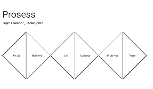
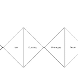
We followed the Triple Diamond framework and worked iteratively.
To understand and define our problem, we conducted:
Expert interviews with service designers, interaction designers, customer and financial advisors, system experts, and insurance specialists.
8 user interviews with insurance customers in our target group (young adults).
A market analysis to review existing products and services for our target audience.
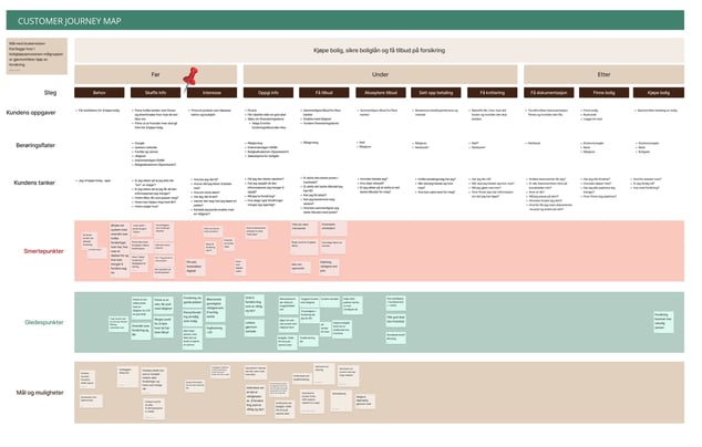
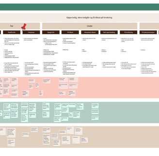
This data collection led to a customer journey map, where we charted our target audience's experience from purchasing a home and securing a mortgage to acquiring insurance.
The journey map helped us pinpoint user pain points and identify areas with the most issues to address in our project.
We noticed a significant need in the pre-purchase phase, where customers seek information and develop interest in products, so we focused on this area.
Idea and Concept Development
Once we had a clear understanding of the problem and the insurance landscape,
we began developing ideas and concepts for a solution.
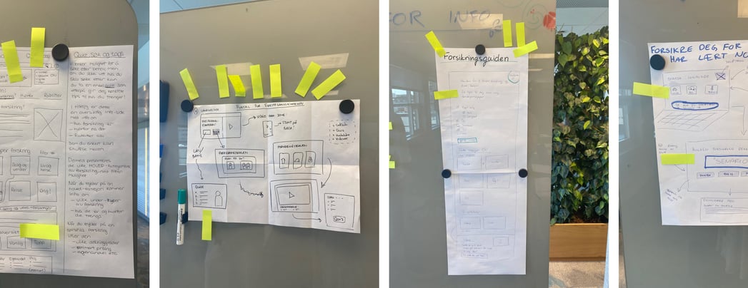
We conducted workshops inspired by the Google Design Sprint, using methods such as:
Worst Possible Idea
Individual Note-Taking and Sketching
Crazy 8s
Solution Sketches in Pairs
Red Dot Voting + Pitching the Selected Ideas
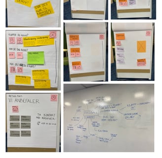
Below are the Solution Sketches that received the most votes,
along with their vote counts (indicated by the yellow Post-it notes).

Prototyping and User Testing
After the idea generation and voting phase, we created our first prototype. The initial concept, called 'Need Calculator,' was a paper prototype tested on the streets of Oslo. We then developed the 'The Bubble Page' concept, which we tested as a low-fidelity Figma prototype, along with a new iteration of 'The Bubble Page.'
Following positive feedback on these prototypes, we advanced to high-fidelity prototyping, leading to the final product presented above.
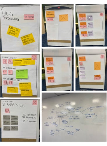

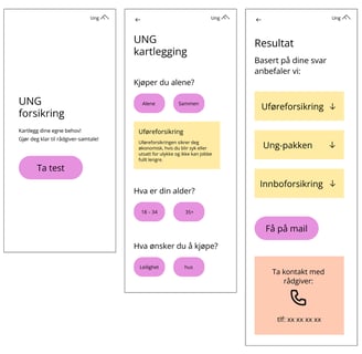
The Paper Prototype of the 'Need Calculator'
Low-Fidelity Figma Prototype of the 'Need Calculator'
Low-Fidelity Figma Prototype of 'The Bubble Page'